CoursePlan (Project Team)

At-A-Glance
This past year I worked on CoursePlan — an established DTI product with 5,000+ users that helps students plan their courses over their college career based on specific requirements (college, major, minor, etc).
⏰ Duration: Aug 2021- June 2022
💁 My Role: Product Designer, User Researcher, Product Strategist
Collaborated in a team setting of devs, designers, project managers, and marketers to develop and distribute impactful products to benefit the Cornell community.
Created high-fidelity prototypes and amplified existing designs for CoursePlan.
Conducted weekly design critique sessions and design education initiatives with 20+ designers across 7 subteams.
⚒️ Design Tools: Figma

As soon as I landed on the team, I was asked to do some user research along with our devs, marketers, and PM.
We had some big questions to answer:
Since CoursePlan is an already established, fully-functioning product, what are some lightweight features we can add to boost user experience?
CP is currently only used at the very beginning and end of each semester, and users rarely visit our website mid-semester as there is no need to schedule one’s courses at that time.
What are some fixes that will hook users into CP to make them visit our page as often as possible?
We created a user research script that overviewed demographic analysis, understanding the users, and light usability testing on the websites that the team had made prior.

A sneak peek of our interview protocol and findings
Upon conducting user research with advisors and current users, some feature ideas we’ve devised include:
Features for users to interact with other users, such as allowing users to create and publicly share lists of popular/fun classes
A GPA calculator to entice users to visit our website occasionally during the mid~end semester
Displaying course exam schedules for classes
Card to leave feedback on the usability of our website

Semester roadmap and design ideas

Background
The first feature I worked on was “popular classes”- a directory of popular classes users can refer to during add/drop season or during mid~end of the semester when planning out one’s future schedule. The course list can be updated monthly and is organized into a variety of playful themes. For instance, CoursePlan could collaborate with the Cornell Daily Sun to poll Cornell students and formulate a list of “courses beloved by Cornellians” or refer to Cornell’s booming Reddit page to enlist an aggregation of “courses most talked about on r/Cornell”
One minor detail I noted when designing was that the popular classes feature was intended to be implemented as a tiny card within the Dashboard page designed by my talented co-designer Yuxuan. I was wary of keeping my designs simple so as not to divert too much attention to it and make clever use of the small sliver of real estate.

CP’s dashboard page, where my feature would be placed
Low-fidelity + crit

Above is a low-fidelity mockup of popular classes. I kept things simple by limiting the amount of information offered to <rank, course name, date, and overall rating.> I immediately took this to design crit, a DTI-hosted weekly design critique session where one’s designs are torn to bits by 20+ designers. I personally find the critiquing immensely helpful and tend to bring all my lo-fis to crit before moving to complex prototypes.
Some questions I asked during crit include:
Would having the median grade in place of “overall rating” be more useful? This could greatly benefit users looking for “easy A” classes.
What if we implemented up & down arrows to have students vote on each course to keep the rankings updating themselves?
How would I make the UI extra interactive?
Should there be a space for students to write reviews and ask course-related questions to each other for increased communication among users?
Here is an annotation of the feedback received on my low-fi design:

Mid-fi evolution


Instead of using this tiny rectangle to display long, physical chunky course reviews, I opted to provide links to resources(Cornell roster, CU Reviews, Reddit) that would direct students to check out reviews and the student voice on enlisted courses.
To boost interactivity, I devised an “add to schedule” button that prompts the user to add a course to their schedule with minimal interaction. They simply have to choose the semester and year, then press “add.”
Some concerns
Before moving on to high-fidelity designs, I took a breather to point out some minor issues that should be addressed prior.
1) I wondered if providing score ratings would be necessary since I was already linking CU Reviews(the DTI equivalent of Rate My Professor) underneath the course name.
2) Despite my intention to import the exact pie chart designs from CU Reviews to preserve their brand identity, I was unsure of the ethics of taking another designer’s work and placing it in another product (even though it is “cited” and they are both DTI products).
3) CU Reviews’ design is not compatible with CoursePlan’s and stands out too much. I decided to consult my PM and reconsider this aspect of the feature.
High-Fidelity + Design-dev handoff
While achieving visual perfection was not an MVP goal, I wanted to elevate CoursePlan and create consistency by making an updated design system with styles and reusable components.

Underneath is my final flow for the “popular courses” feature built out with reusable styles and components.
You can click on the first image and continue clicking on the right arrow to get a full run-through of possible interactions.


Background
The next user-hooking, addictive item I worked on was CP’s GPA calculator.
The purpose of the GPA calculator would be to:
Predict one’s semester GPA during the middle ~ end of the semester, and use that GPA when applying to jobs.
(Most jobs require applicants to input their GPA, and it’s better to add a predicted GPA that includes grades for the current semester as well)
To check whether or not one has made Dean’s List.
Before pre-enroll: adding different classes to one’s list and seeing how it affects their GPA.
“What if… I got all As for these 5 courses I plan to take in FA 22? How would my GPA change?”
Pitching the feature
I pitched the feature to our team by presenting some low-fidelity drawings which included an onboarding tutorial to the GPA calculator and a brief mockup of the GPA calculator interface.

A low-fi mockup containing our onboarding flow
The feature turned out to be a lot more heavyweight than intended, as I had to ask our team the following questions:
Q: Are we taking into account weighted GPAs? Honors classes?
A: No, weighted GPAs are not offered at Cornell.
Q: Would the course names and credit hours be directly imported into the GPA calculator from the user’s original scheduler?
A: Yes, the course names AND the credit hours users took them for will get automatically added to the calculator.
Q: How are we calculating transfer credits and APs?
A: We are not. They carry no weight.
Q: Can we give users a virtual high five when they’ve made it to Dean’s List?
A: While it is possible, it might be discouraging for users who did not make the cut. Moreover, the pie chart designs that reflect one’s GPA might disappoint users with lower GPAs that have half-empty pie charts.
Iterations
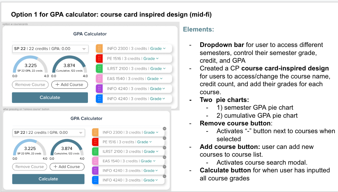
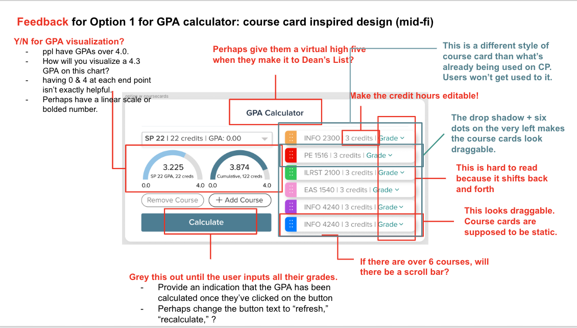
Option 1: The first option was a CoursePlan-inspired design reflecting the feel of our current scheduler interface, but was perceived as heavy(even though it contained the same number of functionalities as my other iteration) and distracting by our users.
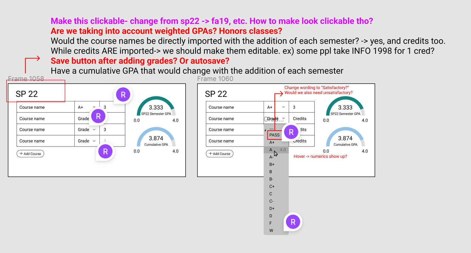
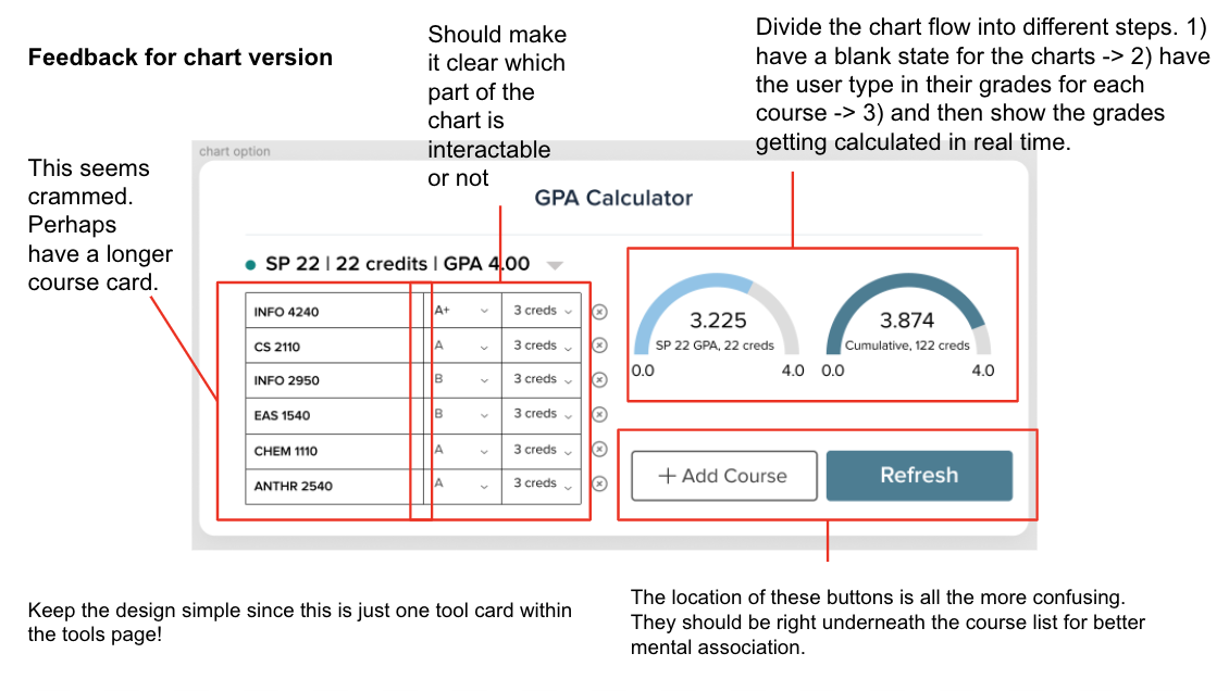
Option 2: I made the second option as minimalistic as possible so it could blend into our tools page seamlessly. During user testing, our users found this to be more intuitive and less confusing.
Midpoint Check-in
The following is screenshotted directly from my status update slides, where I document every minor design detail to keep track of my progress.
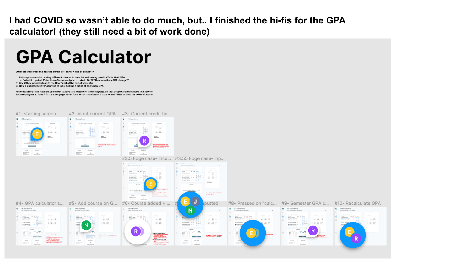
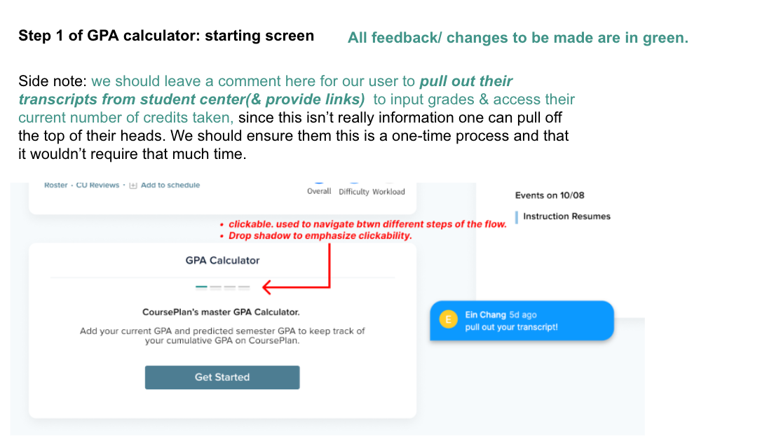
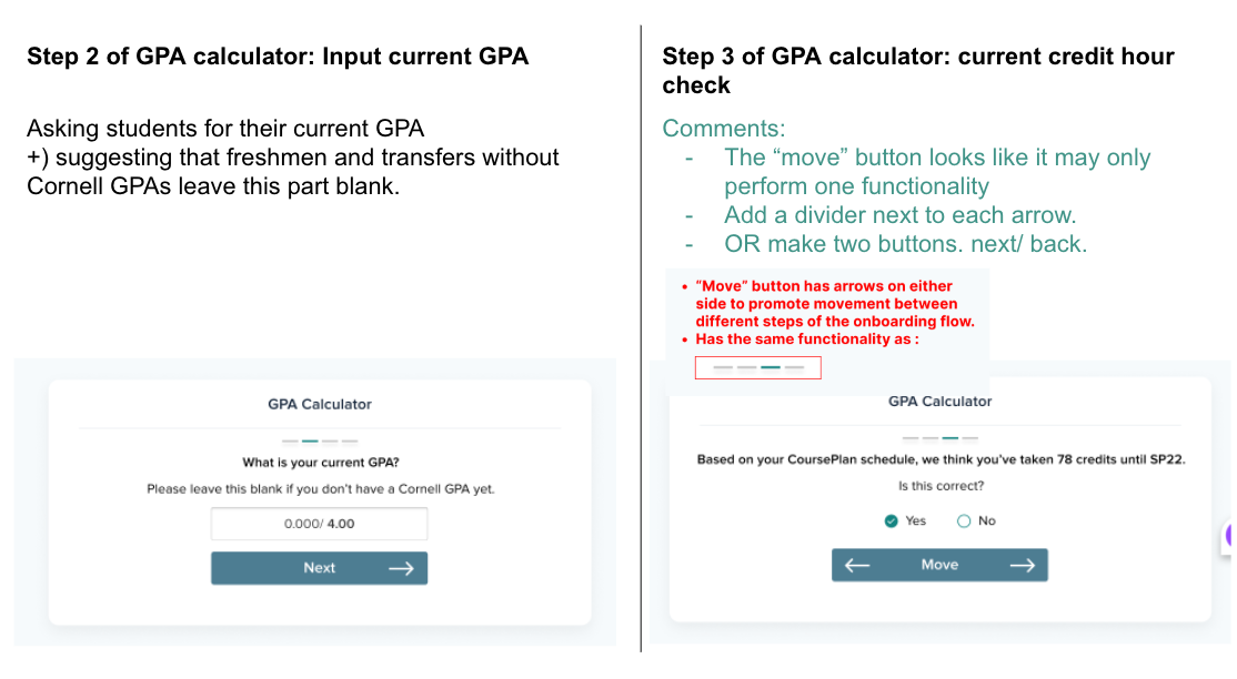
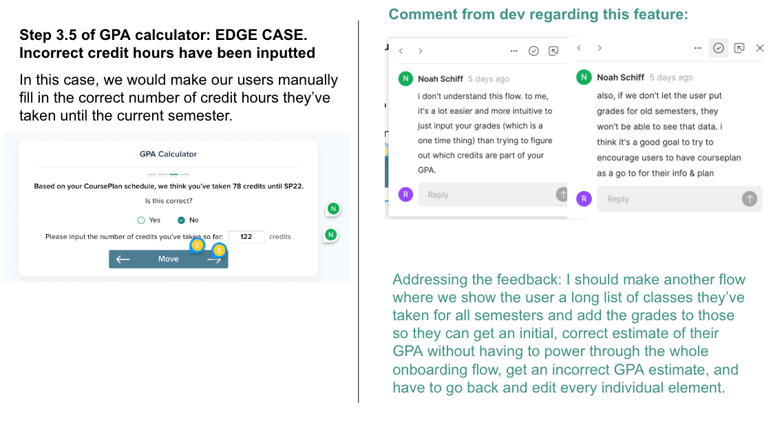
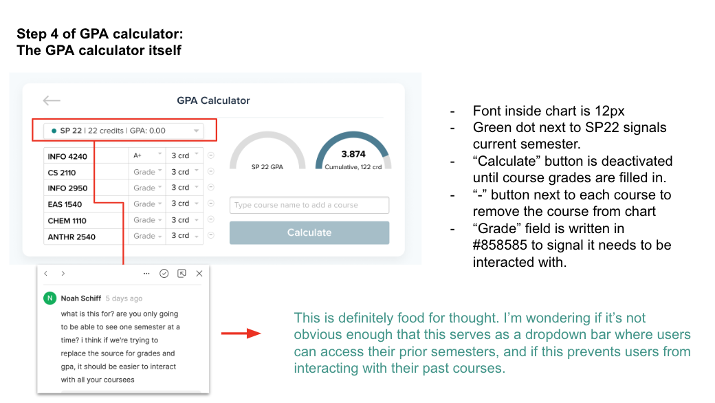
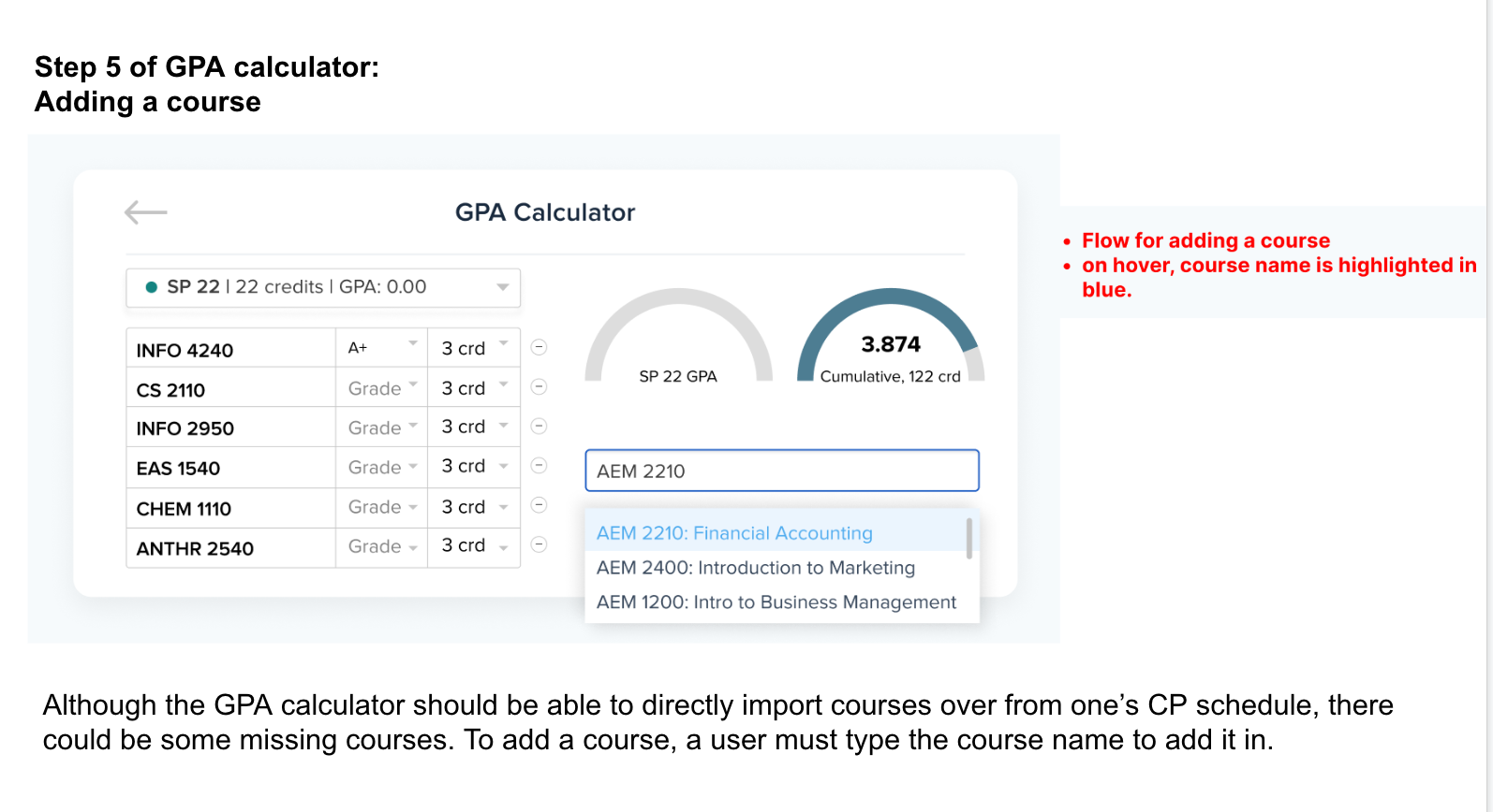
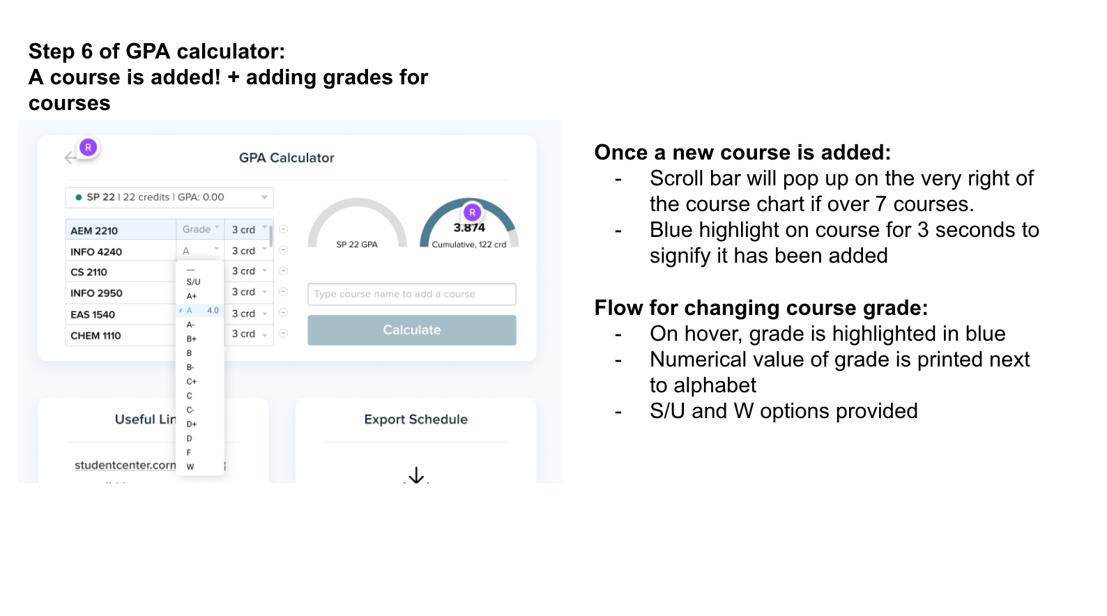
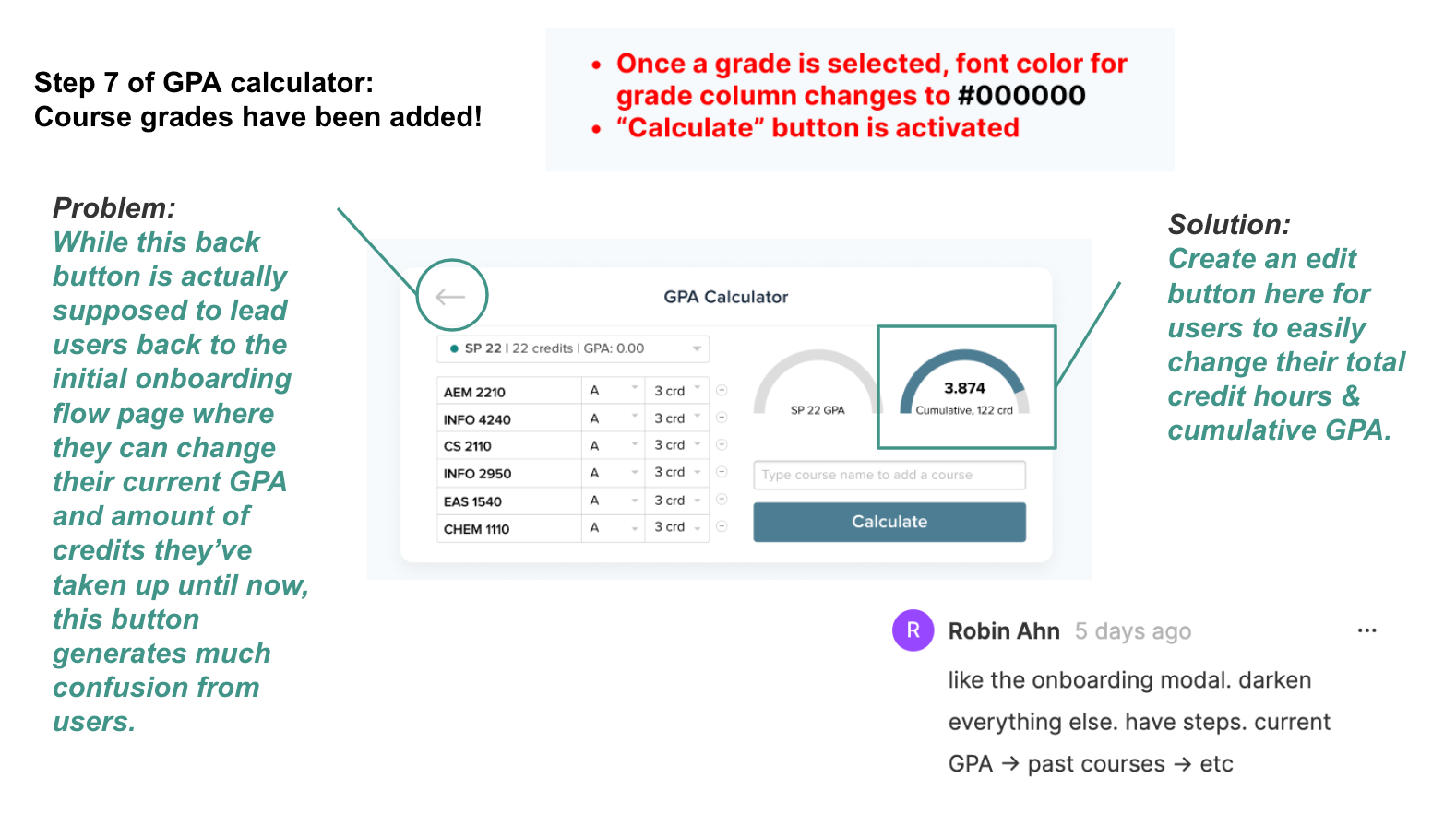
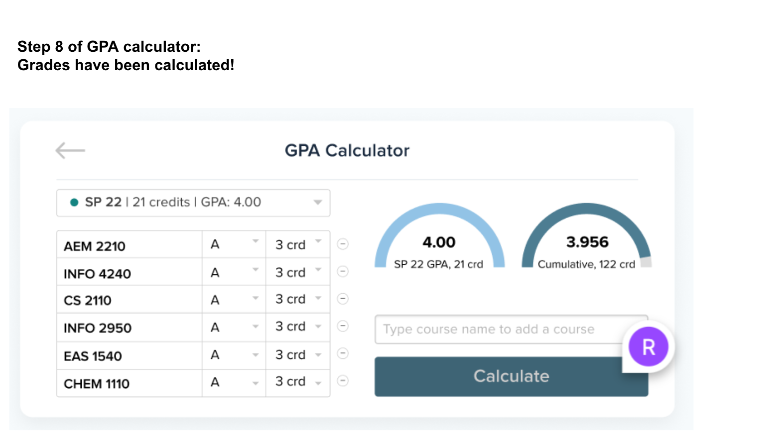
Improvements:
Ask users to fill in their total credit hours and all letter grades they’ve received until the current semester (both factors are required to calculate one’s cumulative GPA)
Added instructions that prompt the user to pull up their transcripts on the first page of our onboarding flow to expedite the data entry process
Simplified adding and removing courses from one’s schedule
Provided the user easy access to return to onboarding screens and get re-onboarded if necessary