Delivery World
Creating an all-in-one data visualization platform to display associate productivity
⏰ Duration: 3 months (April- July 2024)
💁 My Role: As lead designer of the project, my role was focused on working 1:1 with the PM to verify the PRD, establish a user research plan & dive into user interviews, complete synthesis and build designs that would solve the overarching user problem.
⚒️ Design Tools: Figma, Figjam, Spreadsheets
Fully analyzed & digested the current spreadsheets being used by our managers & VPs on the job
I even stayed in those spreadsheets for hours on end to observe where one’s cursor lingered on the most
Based on the content displayed & user behavior observed, I wrote down a list of hypotheses(& assumptions on user needs) to validate during the user interviews
Based on my analysis of the PRD, current tools utilized, and multiple conversations with the PM, I was able to build user stories based on my assumptions of the current workflow and chunk them down into 4 themes.
Here’s a high-level overview of the questions I asked during user interviews.
In reality, they were multiple variations of each question tailored towards the interviewee’s job description (VP/ Manager/ CST).
To obtain a full picture of how managers measured productivity and allocated projects on a daily, I captured every single action item that went into the productivity measurement & project allocation process in chronological order. I ensured to denote the different datapoints required to perform each step, and how our users utilized current platforms to achieve their goals while capturing any glaring pain points and user needs.
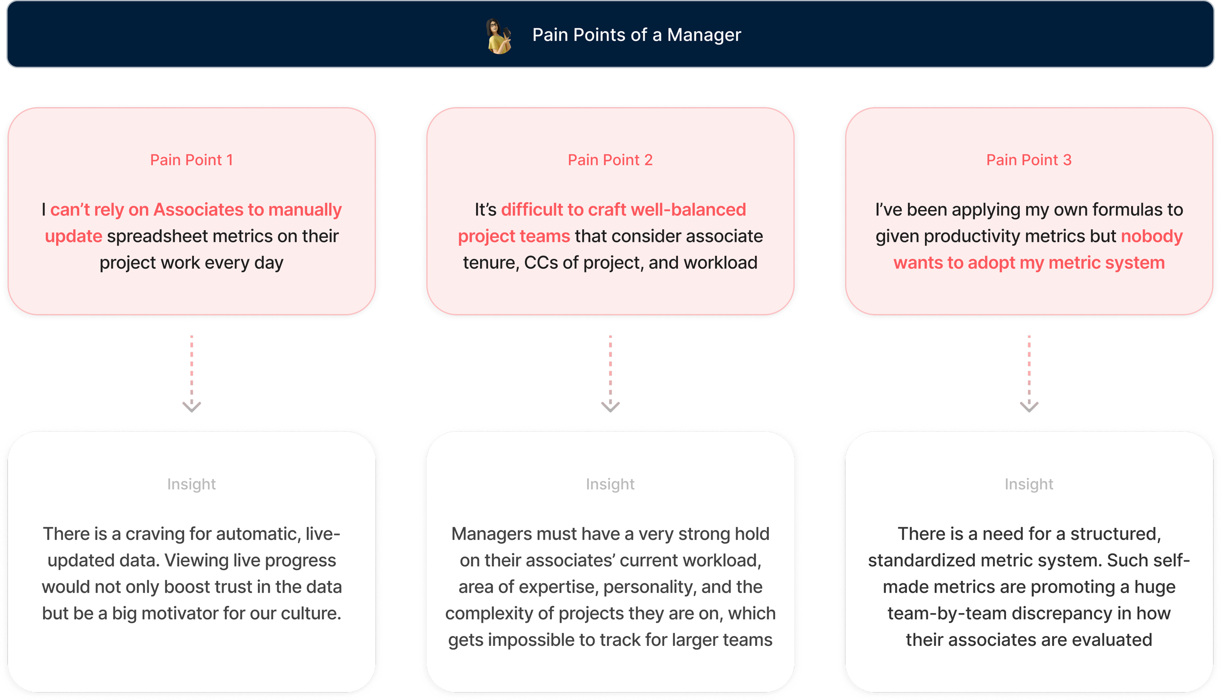
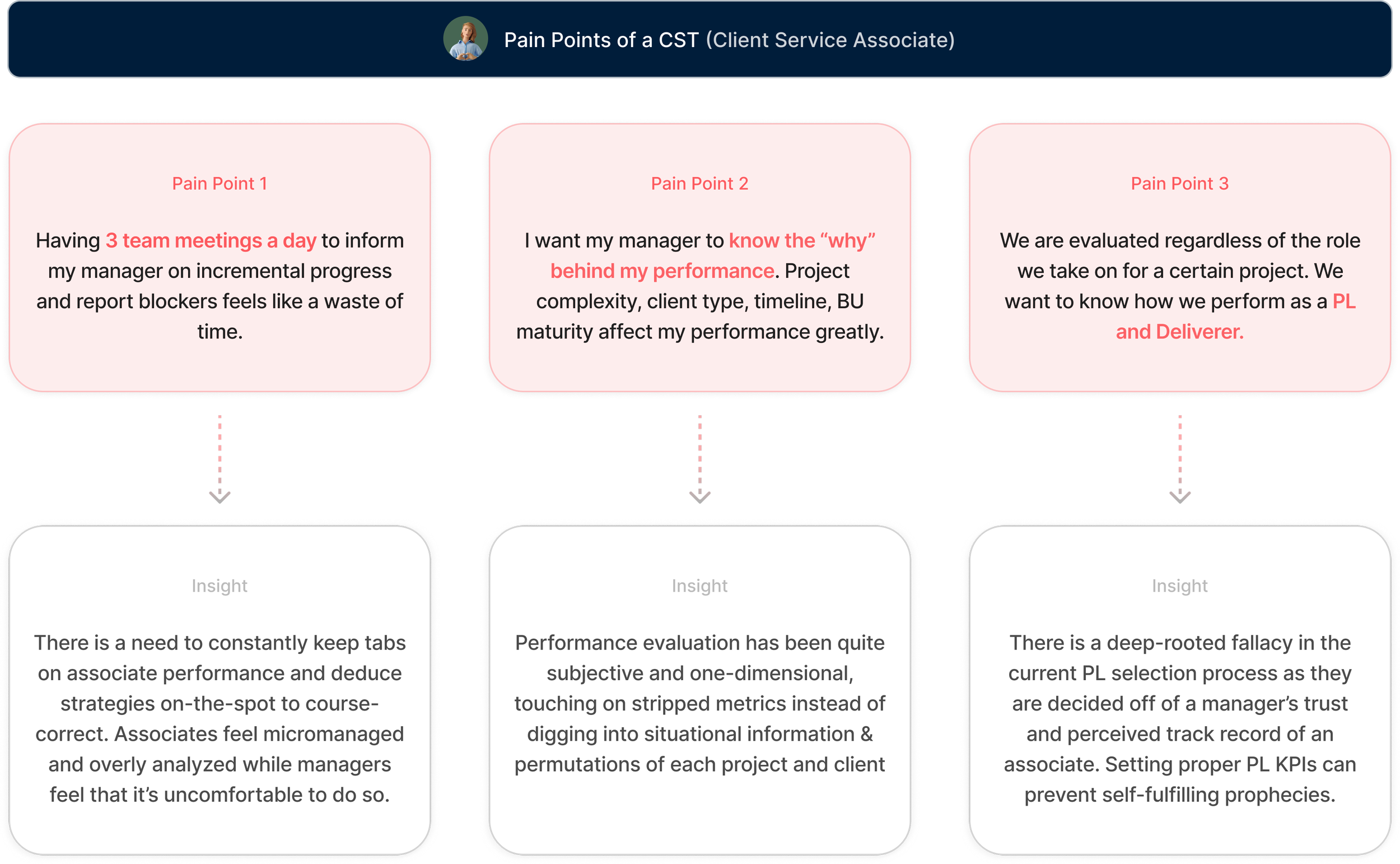
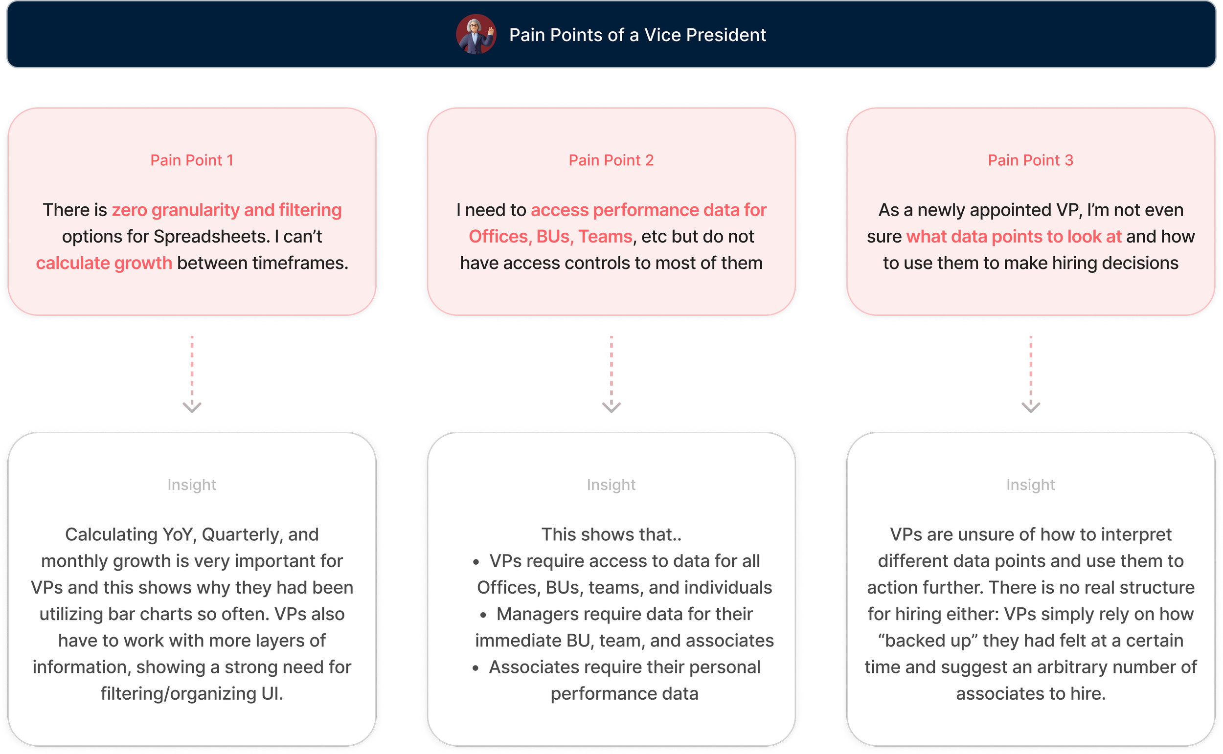
The data our users were working with wasn’t live- managers had to click into their respective spreadsheets to update productivity metrics monthly, which limited them from viewing granular(daily, weekly) growth depending on the specific timeframe, and was more subject to human error
There were limitations in accessing the productivity data of other offices/BUs/teams, thus blocking managers from obtaining a full, well-rounded understanding of team-by-team performance. Users had a thirst for viewing other teams’ productivity data so they can learn what the standard should be & effectively strategize to catch up
Managers currently rely on intuition to evaluate PL performance as there is no team-wide standard in evaluating PL productivity
They did, however, have a moderately aligned view on how they evaluated deliverer productivity- which is to analyze TSCs, CCs, and N of Live Projects, along with Custom Proposed.


Based on the user interviews, I went on to build a JTBD ladder which specifies overarching user wants and outlines the granular steps/ data points our users would require to achieve their goals. The JTBD ladder has been helpful in weighing the effort vs value to calculate which features belong in the MVP.
Underneath is a list of the most important, MVP-worthy HMWs that were deemed relatively easy to build(confirmed by engineering) yet can fully tackle the overarching issue of this whole project which was that “Productivity & Project allocation metrics are currently spread across multiple, manually-updated spreadsheets.”


How does the design meet each HMW?
A close look into the functionality, UX benefits, and requirements of each feature
Upon having users test out the MVP version, we were able to obtain further feedback that was projected to add immense value to the user experience if crystalized into usable features. We synthesized the feedback into 5 crucial HMWs and got to iterating on designs that could best address them.
Interactive UI that allows the manager to assign “best fit” PLs to a project upon calculating their Productivity and Workload
Advertises DW as the ultimate Productivity Platform and has a high potential of intriguing managers to visit DW for more
Has a short blurb at the bottom to increase user trust on how the metrics were calculated
Positioned on the “Dashboard”- a platform associates utilize daily to track their expert calls and surveys
Added a conspicuous button that triggers a panel summarizing Delivery World metrics, providing the user with a good sense of their productivity score and how they compare to the office average
There are numerous “refresh” buttons placed meticulously to emphasize to the user that the data is live and controllable
Suggests a meticulously calculated “golden standard” of metrics users must work towards, instead of supplying a laundry list of productivity metrics
Teaches users how to utilize these metrics to improve their performance by suggesting incremental next steps
Rids associates the need to approach their manager too often for advice- as they can access tried-and-tested next steps at-hand
Suggests potential reasons behind identified trends from the graph, and even suggests internal documents that can help the manager discern the actual reasons behind uptick/downticks
Before my final handoff of the product, I was able to create a design vision that consisted of solid design principals and an ultimate design direction that future features of Delivery World must abide by. These guidelines were presented to the rest of the design team to ensure they remained aware of the branding of Delivery World.


